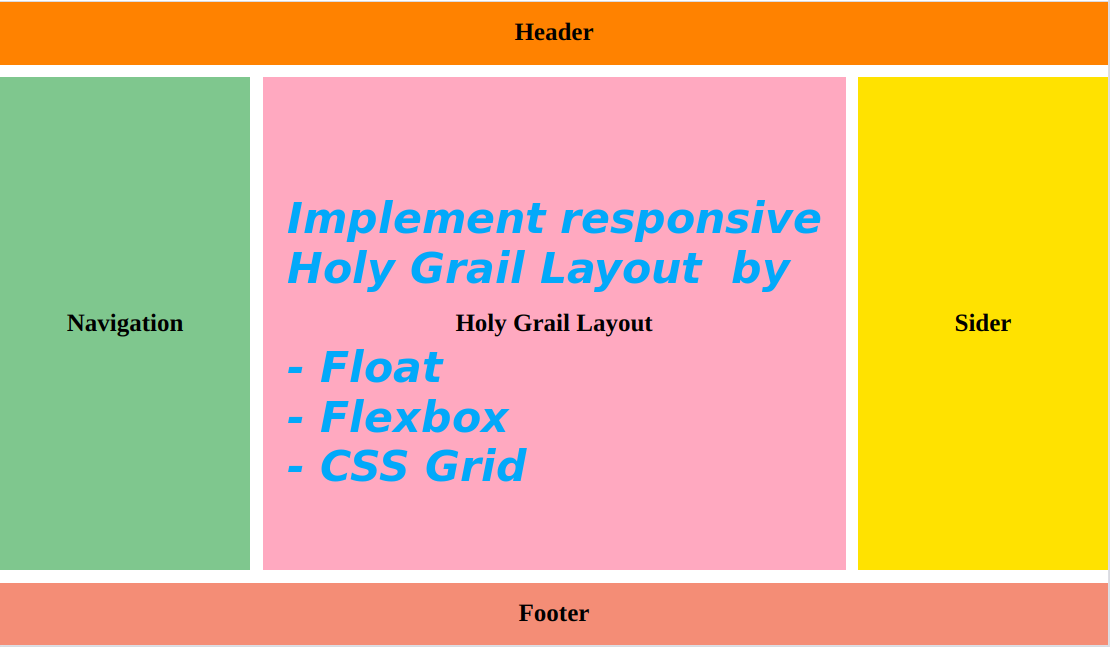
Holy Grail Layout is a classical three-column layout, I will implement it here via three methods: use traditional CSS float property, flexbox and CSS grid separately. The main parts of holy grail layout above should have: height of header and footer: 50px width of two sider columns: 200px responsive height of the three columns, width of the main content Use float property to layout the middle three columns CSS Code Markup Code Use flexbox CSS Code Markup Code: The same with using float Use CSS grid CSS Code Markup Code Comparision float: It is a little complex, and needs to clear the float property from the parent box flexbox: Really flexible, less code, easy to achieve from one dimension - by rows in this case css grid: A two-dimension way to layout, we need to have a good division of the boxes
Sunflower
Stay hungry stay foolish
Troubleshoot unstable site access caused by wrong tcp socket recycle setting
Four steps to add Google Fonts in Tailwind CSS
A note-taking of using Webpack 5.x
ESLint & Prettier: Enable semi option without complaints
Understand git HEAD from git internals
Fix XAMPP mysql start issue: /opt/lampp/bin/mysql.server: 264: kill: No such process
Troubleshooting AWS EC2 failure: instance reachability check failed of Status Check
New Promise functions: Promise.allSettled(ES11/2020) and Promise.any(ES12/2021)
Uninstall LibreOffice and Install WPS 2019 on Ubuntu 20.04
Ways of Vue components communication and How to use Vuex State Manager
ESLint & Prettier: Enable semi option without complaints
How to add custom shortcut key bindings on Ubuntu 20.04?
Categories