Holy Grail Layout is a classical three-column layout, I will implement it here via three methods: use traditional CSS float property, flexbox and CSS grid separately.
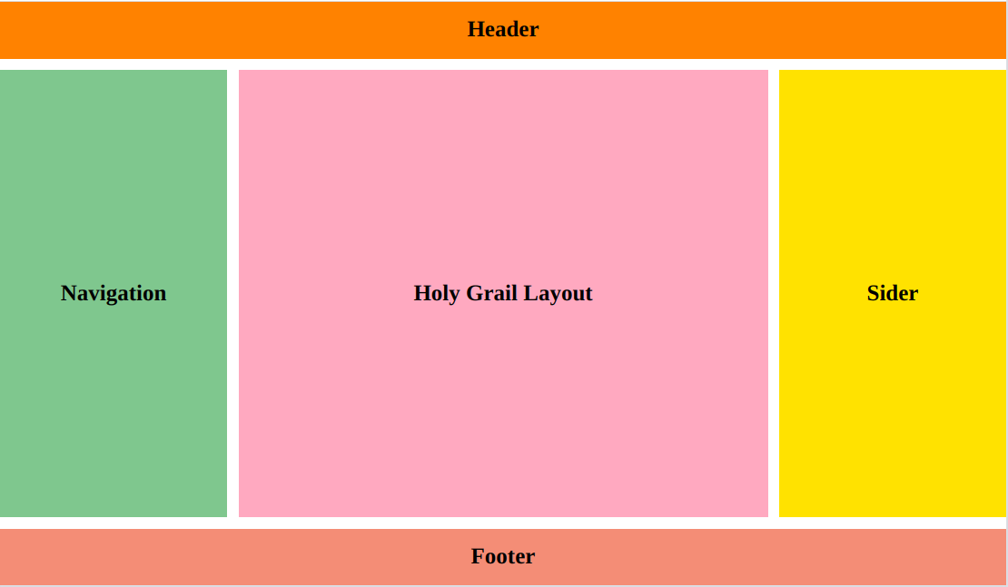
The main parts of holy grail layout above should have:
- height of header and footer: 50px
- width of two sider columns: 200px
- responsive height of the three columns, width of the main content
Use float property to layout the middle three columns
-
CSS Code
<style> body { margin: 0; font-size: 20px; font-weight: bold; } /* Make Text in the middle */ header, footer, nav, main, aside { display: flex; justify-content: center; align-items: center; } header, footer { height: 50px; background-color: darkorange; } .container { overflow: hidden; margin: .5rem 0; } .container nav, .container aside { width: 200px; height: calc(100vh - 100px - 1rem); } .container main { float: left; width: calc(100% - 400px - 1rem); height: calc(100vh - 100px - 1rem); background-color: lightpink; margin: 0 .5rem; } .container nav { float: left; background-color: darkseagreen; } .container aside { float: right; background-color: gold; } </style> -
Markup Code
<body>

  <header>Header</header>
  <div class="container">
    <nav>Navigation</nav>
    <main>Holy Grail Layout</main>
    <aside>Sider</aside>
  </div>
  <footer>Footer</footer>

</body>
Use flexbox
-
CSS Code
<style> body { margin: 0; font-size: 20px; font-weight: bold; } /* Make Text in the middle */ header, footer, nav, main, aside { display: flex; justify-content: center; align-items: center; } header, footer { height: 50px; background-color: darkorange; } .container { display: flex; flex-direction: row; justify-content: space-between; height: calc(100vh - 100px - 1rem); margin: .5rem 0; } .container nav, .container aside { width: 200px; background-color: gold; } .container main { flex: 1; margin: 0 .5rem; background-color: lightpink; } </style> -
Markup Code: The same with using float
Use CSS grid
-
CSS Code
<style> body { margin: 0; font-size: 20px; font-weight: bold; } /* Make Text in the middle */ header, footer, nav, main, aside { display: flex; justify-content: center; align-items: center; } .container { display: grid; grid-template-areas: "header header header" "nav content sider" "footer footer footer"; grid-template-columns: 200px 1fr 200px; grid-template-rows: 50px 1fr 50px; grid-gap: 10px; height: 100vh; } header { grid-area: header; background-color: darkorange; } nav { grid-area: nav; background-color: darkseagreen; } main { grid-area: content; background-color: lightpink; } aside { grid-area: sider; background-color: gold; } footer { grid-area: footer; background-color: darksalmon; } </style> -
Markup Code
<body>
  <div class="container">
    <header>Header</header>

    <nav>Navigation</nav>
    <main>Holy Grail Layout</main>
    <aside>Sider</aside>

    <footer>Footer</footer>
  </div>
</body>
Comparision
- float: It is a little complex, and needs to clear the float property from the parent box
- flexbox: Really flexible, less code, easy to achieve from one dimension - by rows in this case
- css grid: A two-dimension way to layout, we need to have a good division of the boxes
Comments